And that’s what the LaTeX template does, using the mathptmx LaTeX package. As the package name suggests, it also provides a version of the Times font for math typesetting, which is quite important for most LaTeX users. One of the many flaws of mathptmx is that it’s extremely obsolete and everyone strongly suggests against it:
The 3rd edition of “The LaTeX Companion” published in 2023 warns against it.
The esteemed TeX StackExchange user egreg has said “remove mathptmx, which is a 25-year-old hack” in 2024.
etc.
One reason against mathptmx is that its math font is an inconsistent mess, as described by CTAN page:
[…] provides maths support using glyphs from the Symbol, Chancery and Computer Modern fonts together with letters, etc., from Times Roman.
The successor of mathptmx is txfonts which is also obsolete by now. And its successor is newtx which isn’t yet obsolete. Another non-obsolete alternative is to use the TeX Gyre Termes Math font. In this post, I will try switching my PhD thesis to both modern alternatives to compare them and find the best one to use instead of the ancient mathptmx.
Setup
Before diving into the comparison, here are the three LaTeX setups I will be comparing (click each tab).
This setup is the relevant part from the PhD thesis template, only inconsolata is my addition. It might not even show up any of the examples below but its placement in the package loading sequence matters.
Helvetica (phv) loaded like this is visibly larger than Times, both for lower- and uppercase letters, but this doesn’t seem to have bothered anyone using the template?!
Since TeX Gyre Termes Math only exists in the OpenType Format, I tried it out under LuaLaTeX. This requires a different way of loading text and math fonts (with fontspec and unicode-math respectively).
In order to minimize the visual differences with the newtx setup, I’m using TeXGyreTermesX from newtx instead of TeX Gyre Termes for the text. Moreover, I’m using the same scaling for Heros and Inconsolata as the newtx setup does implicitly. This scaling might not be optimal, though: neither lowercase nor uppercase letter height is matched.
Since unicode-math doesn’t define \llbracket and \rrbracket (like stmaryrd and newtxmath do), they’re defined using the corresponding unicode-math symbols to make the rest of my thesis easily compile.
Text mode
Although this post isn’t about Times in text mode, there is one difference worth pointing out.
mathptmx
newtx
TeX Gyre Termes
(Click on images to zoom.)
The small caps (\textsc) in newtx is a bit heavier than in mathptmx, but the small capitals are a bit shorter. And this already is newtx loaded with the largesc option to get large small caps; by default, it offers petite caps which are even smaller.
Since Termes in the rightmost figure is actually TeXGyreTermesX from newtx but in OpenType format, the small caps look almost the same as in newtx, but not quite! Somehow LuaLaTeX and the OpenType version allow for overly close kerning between certain letter pairs, causing uneven spacing across the whole word:
“ac” in “RacerF”,
“ag” in “Deagle”,
“Da” in “Dartagnan”,
“pa” in “UTaipan”,
“Ac” in “CPAchecker”.
On a side note, unicode-math in LuaLaTeX redefines \vdots to only work in math mode, which is why it’s missing in the figure (but easily fixed by just using it in text mode). The LaTeX default \vdots works in both modes because it’s not actually using a symbol from the font.
Math mode
With text mode out of the way, the rest of the post compares Times in math mode.
Parenthesis kerning
mathptmx
newtx
TeX Gyre Termes
Kerning between the left parenthesis and certain letters is bad in Termes. The parenthesis outright collides with ‘f’. The parenthesis doesn’t collide with ‘p’, although at normal text size it feels suspiciously close, even though the other fonts actually have a similar gap.
The latter comes down to the different parentheses:
In mathptmx they are the lightest but also tallest, extending below the descenders of ‘p’ and ‘f’.
In newtx they are the heaviest but of medium height, in line with the descenders.
In Termes they are of medium weight but the shortest, not reaching all the way around the descenders.
On a side note, in mathptmx the \mathsf used for “unique” and “create” doesn’t actually use Helvetica (or its clone) but just Computer Modern Sans. This causes a dissonance with the sans-serif font in the text mode (e.g. \textsf), which does use a version of Helvetica. Thus, the same document mixes two different sans-serif fonts.
Subscript kerning
mathptmx
newtx
TeX Gyre Termes
Ignoring the exact letterforms, subscript kerning is quite similar in mathptmx and newtx. Both have a bit too much space between the ‘x’ and the subscript ‘j’. This issue is acknowledged by newtx, which offers the package option subscriptcorrection. Using some LaTeX hacking, it implements special behavior to reduce the left kerning of certain letters appearing first in subscripts. This fixes the issue with ‘j’ but for some strange reason unnecessarily reduces the spacing in front of other non-problematic subscripts which aren’t even declared in its default subscriptcorrectionfile.
Subscript kerning in Termes is all over the place:
It gets the kerning in x_j correct out of the box.
It leaves too little space in \mathrm{st}_f.
It leaves way too much space for subscripts on \mathcal letters.
(Double) brackets
mathptmx
newtx
TeX Gyre Termes
The double brackets (\llbracket and \rrbracket) in newtx are noticeably heavier than all other symbols and really stand out on a full page. Like in mathptmx, they consist of two normal (single) brackets close together (duh), but it becomes too much with the thicker single brackets (which match the parenthesis) in newtx. Termes has solved the weight issue by having the single brackets in a double bracket slightly lighter, giving a more uniform look overall.
Furthermore, the double brackets in newtx are slightly taller than the normal brackets, which is not the case for the other two fonts. Given the bracket nesting, it might even be a good thing in this example, but it’s a strange mismatch in general.
Additionally, bracket kerning is quite generous in newtx. In mathptmx letters almost look like they reach into the brackets (although they actually don’t, but there’s no additional space either), but in newtx there is additional space. The gap between the double bracket and the single bracket is particularly visible in newtx.
On a side note, in mathptmx the \mathbb{T} in the subscript is clearly distinguishable from a normal T, but not so well in the others. In newtx this situation can perhaps be improved by choosing a different \mathbb variant using package options.
\leq vs \preceq
mathptmx
newtx
TeX Gyre Termes
The \preceq relation in Termes is mistakably similar to \leq, especially at normal text size, because it doesn’t bend as much as the others. The same probably applies to \prec vs <, etc.
The \preceq in newtx has a particularly small gap between \prec and the bottom equality line, but I can live with that over Termes.
On a side note, in mathptmx the ‘i’ appears much closer to the \leq relation than the ‘j’.
\setminus
mathptmx
newtx
TeX Gyre Termes
The \setminus operator in Termes is unusually wide: both in terms of its angle and its (left) kerning. I suppose it’s intended to match the width of other set operators (e.g. \cup, \cap) but I’m so used to the thinner one from Computer Modern. On the other hand, Termes has the most balanced left vs right kerning for it, with mathptmx being particularly uneven.
\nabla and \Delta
mathptmx
newtx
TeX Gyre Termes
The \nabla and \Delta are specifically used as binary operators in abstract interpretation and, thus, properly wrapped in \mathbin here. Surprisingly, they have different width (or kerning) in mathptmx, as clearly seen from the misalignment of their right arguments.
Annoyingly, \nabla in newtx is heavier than \Delta by having two thick sides instead of one. Not only are they asymmetric, the heaviness of \nabla stands out on a full page. Newtx offers \laplace as a similarly heavier version of \Delta, but that would make the latter stand out as well. Instead, I would like the opposite: a lighter version of \nabla that matches the \Delta, but newtx doesn’t offer that.
On a side note, in Termes \mathrm{\Delta} does not work, despite \Delta being already upright. This is a bit strange since unicode-math documentation explicitly mentions \mathup\Delta and that \mathup is just an alias for \mathrm. I’m not sure why I had used \mathrm{\Delta} in the first place, perhaps it’s a relic from using the operator macro with a different font which defaulted to italic uppercase Greek letters.
\times
mathptmx
newtx
TeX Gyre Termes
The visual perception may be somewhat due to the not-so-common use of the \times operator, but:
In mathptmx it is a bit light compared to the rest.
In newtx it is heavier but really touches the baseline and doesn’t look as good.
In Termes it is smaller (but suitably heavy) and closer to the middle line of the numbers, which looks the best in this context.
\texttimes
newtx
After switching to newtx I noticed that another similar instance looked different because it used the Unicode × in the LaTeX source. Turns out this is mapped to \texttimes which differs from $\times$ in newtx and fixes my problem.
Miscellany
mathptmx
newtx
TeX Gyre Termes
First, there is no \coloneqq in Termes. However, there is \coloneq, so the former omission is odd.
Second, there is no \square in Termes. The one in the Termes figure comes from amssymb and is thus the same one as in the mathptmx figure. It is too light for Times.
Third, differences between text mode and math mode parentheses are visible:
In mathptmx the math mode ones are too light.
In newtx they appear to be the same, which is great for consistency.
In Termes they are quite similar, although the math mode ones are slightly shorter but not too light.
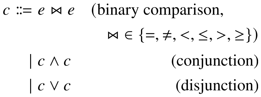
Fourth, the \bowtie operators are very different in size:
In mathptmx it is the largest and most clearly visible.
In newtx it is scaled down and heavier. This kind of matches with the smaller \square in newtx though.
In Termes it is microscopic and horizontally squashed. The holes in the bowtie are hardly visible at normal text size.
\Join
newtx
After digging into newtx font files with FontForge I accidentally noticed that it contains two different bowties! Turns out the other one is is less squashed and provided as \Join in newtx.
Conclusion
Clearly mathptmx inferior to both newtx and Termes. Based on my observations above, I think newtx is the better one of the two. Termes needs some improvements to kerning and math operators.


 newtx
newtx


 newtx
newtx