Springer anti-typesetters, part 2
This post continues the Springer typesetting saga from part 1 on a pair of papers in March 2024. We had two papers (Saan et al., 2024; Saan et al., 2024) accepted into the same conference proceedings and they were edited very differently. The following compares our submitted camera-ready version with the many proofs from Springer typesetters.
Proof 1
The first pair of proofs for the two papers were near-perfect. In both papers they just removed spaces between authors’ email addresses, i.e., {a, b}@c.d was replaced with {a,b}@c.d, which is harder to read in typewriter font but whatever. (They also did this for the paper in part 1.)
However, Springer still managed to introduce inconsistencies. Both papers are open access and have a paragraph about CC BY 4.0 after the references. In the Goblint Validator paper they inserted a dot after the bolded “Open Access” which begins the paragraph and changed the license URL into typewriter font (unlike all other URLs in the paper which were unchanged).
Proof 2
After accepting the first proofs, Springer emailed a second pair of proofs because they forgot to add artifact evaluation badges to both papers. Apparently their fabulous proof checking system cannot be used a second time so this had to be done completely by email.
In the Goblint (verifier) paper, the only change was indeed the addition of the badges. In the Goblint Validator paper, they intentionally screwed everything else up while adding those badges. Here’s the worst of what they did.
Misencoding editor names
In the year 2024, Springer still struggles with encodings: name of the proceedings editor Laura Kovács appeared like this:

Replacing small caps font in title
It’s common for tool names to be in small caps (\textsc) in paper titles, especially for these SV-COMP tool papers in TACAS proceedings. For some reason, small caps wasn’t enough for Springer and they made it bold italic small caps. I have never seen this in a paper title (or anywhere for that matter).
The following image comparisons illustrate the pessimization from our camera-ready version to Springer’s proof (it’s very easy to tell which side is which version). Hover/swipe across the images to fully appreciate the horror.


Expanding author emails
In this iteration they went a step further and expanded all author emails, i.e., {a,b}@c.d was replaced with a@c.d, b@c.d, which takes up more space. I don’t understand why it was necessary for this version of this paper, but not any other.
Reformatting tables entirely
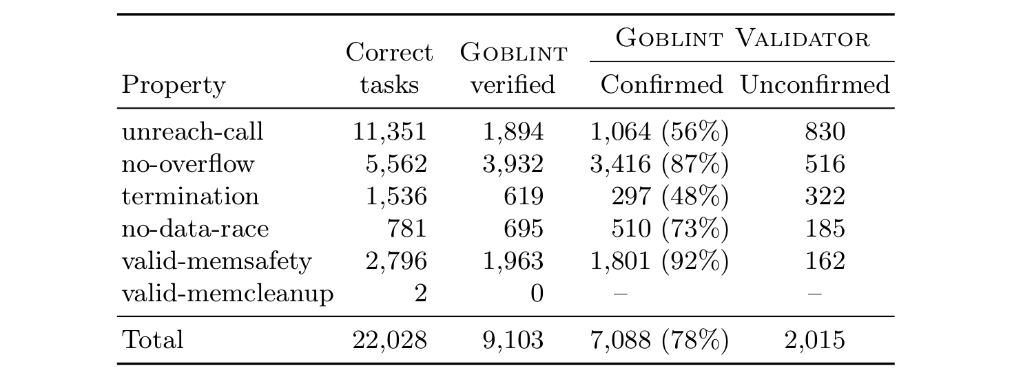
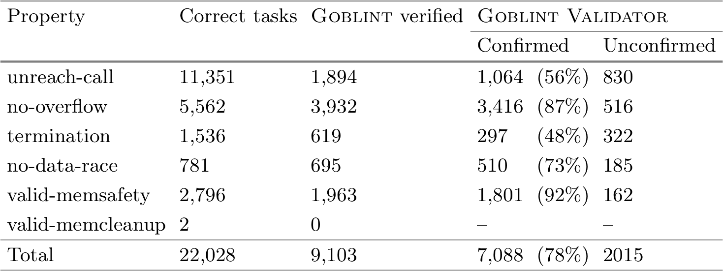
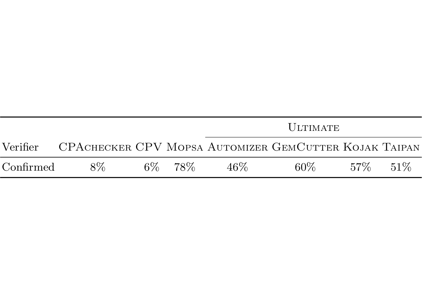
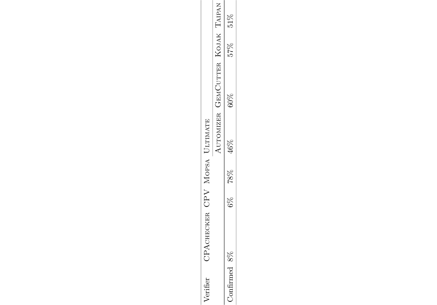
Just like in part 1, Springer redid booktabs tables with the following changes:
- All columns are left-aligned (again). That is especially bad for numeric data spanning multiple orders of magnitude. Our tables with
siunitxcolumns that properly align digits and decimal points were ruined. Columns of centered checkmarks and crosses became awkward. Centered\multicolumnspans became odd. - Line breaks from multi-line column headers were removed. This makes some columns overly wide.
- Row spacing was increased.
- The font for tables was changed to something not matching the rest of the paper (again).
This time they didn’t add vertical column-separating rules between all columns!
Table 1
Note how they changed “2,015” to “2015” in the bottom right cell, thinking it’s a year or something.


Table 2
Yes, they moved this table onto a separate page and rotated it 90° (in addition to all of the above).


Proof 3
After painstakingly listing all the unnecessary changes they made as typesetting errors in the Goblint Validator paper, Springer gave up on (most of) their stupidity and reverted to the first proof (with artifact badges correctly added this time).
And yet, they still had to mess up something. In two places, end-of-line punctuation was shifted from the baseline to above the text. It is beyond me, how to do this accidentally.


Conclusion
At least this time Springer listened and properly undid all the ugliness, so I don’t have to feel shame about how the publisher’s versions of my papers look. But clearly they haven’t stopped making arbitrary unnecessary changes, which wasted everyone’s time, and unfathomable accidental changes.
Stay tuned for part 3! (It’s bound to happen…)